My UX Process is Simple.
I listen and translate. I research and analyze. I strategize and create. I delight and design.
The Making of HomeBase:
UCD Process from Idea to High-Fi Prototype
The HomeBase UCD Process
My mother is 77 years old. She often has trouble accomplishing daily tasks such as checking the weather, ordering food and remembering doctor's appointments. My mother is no Luddite. She LOVES her tablet. Yet, she doesn't own a smartphone. Doesn't like typing on her computer and prefers haptic commands over text. At the same time she's fiercely independent. She often uses discovery to figure out how to use her tablet. She presents a unique design challenge: Create a digital product for an analog user.
I decided to use my Capstone project for my M.S. in HCI at DePaul University to design a product made specifically for users such as my mom who use technology but not in a traditional way. My challenge was to find a way to use technology to help seniors accomplish daily tasks with minimal real-time help from caretakers. The result is Homebase.
I created Homebase along with two teammates from DePaul University, Nick Aleck and John O'Connor, both seasoned experience designers. They were both interested in creating digital products for seniors and I am so thankful for their guidance and participation.
HomeBase is a tablet application that helps seniors in assisted living facilities or who have a home caretaker accomplish daily tasks. The application also offers a simple way to communicate with friends, family, medical professionals and caretaker staff.
The overall design is a "push," model, populating information automatically for seniors relying on haptic controls rather than keystrokes. We completely redesigned the interface. Information is fed through a "bulletin-board," style, simple interface with minimal cause to "pull," information through keystrokes. Caretakers, medical staff "push," information to the seniors who can easily get to it through voice and touch commands. Here's how we designed Homebase:
Step 1: User Research
Since we were dealing with a population that had very little usability research in the literature review, I decided we should do a contextual inquiry with seniors of various ages, and familiarity with technology but lived in an assisted living facility or who had a caretaker. We recruited seniors at assisted living facilities, a local senior center and within our own families to get a broad-based sampling of seniors who use assistive technologies. We wanted to see how they use technology and come up with a mental model of what they thought a tablet application should look like and how it should work. In addition, I attended a series of educational courses taught at a local senior center on Chicago's south side to observe how seniors used technology in a classroom setting. In addition I did expert interviews with caretakers and senior tech instructors.
Step 2: Data Analyzation
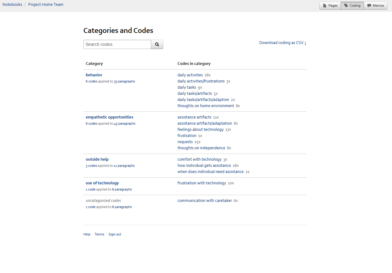
Once we conducted six contextual interviews we transcribed them and uploaded our data into Saturate app, an application that allowed us to quickly dissect our participant responses into thematic categories. I came up with six categorical patterns that were seen across all participants in their execution of daily tasks and their pain points or struggles with those daily task executions. We used those themes to create an affinity diagram on Stormboard. We also used these interviews to develop a mental model that explained the behavior, attitudes and motivations of this user group when it came to using technology and accomplishing their routine daily tasks. This helped us formulate their expectations and limitations they placed on technology to help them with the daily tasks.
One insight from data analyzation:
Current seniors do not have the lifelong experience with technology that younger people will have when they are seniors. The instructor told us that she observed seniors have a literal physical barrier when it comes to technology. Many of them think in analog ways. The are comfortable with the telephone and the television because they can physically see how they work. But they become a bit confused in the metaphorical world of computers including concepts such as “the cloud,” and file transfers via USB ports. One senior interviewed even said she didn’t “have a need” for technology.
So how do you design a digital product for people with an analog mental model?
Step 3: Translating Data into Design Principles
The affinity diagram became the foundation for must have design framework and our task flow creation. We used these interviews to develop a mental model that explained the behavior, attitudes and motivations of this user group when it came to using technology and accomplishing their routine daily tasks. This helped us formulate their expectations and limitations they placed on technology to help them with the daily tasks. When creating the task flow we made sure to incorporate the design principles stemmed from the insights in our data analysis. For example, we found that seniors have no concept of "the cloud." They don't really get what it means to store information elsewhere. They have a literal interpretation of technology use. They also do not like to make mistakes. It frustrates them when they can't get back to where they started. So we translated this into design principles of lots of feedback needed, simplified IA, simplified functionality, one task per screen and prominent "out" buttons.
Step 4: Making Design Features Align with Data
Once we had the main pain points/frustrations our participants said they had accomplishing daily tasks we set out to design a low-fi user interface that would use technology to address some of the pain points.
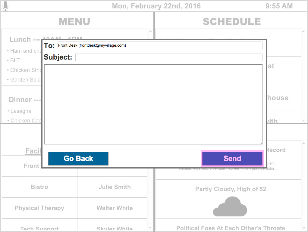
For example, participants said they had a tough time making that daily "I'm alive," call to the front desk. Sometimes they forgot, other times they couldn't find the call button. So we created a user interface that would allow them to call the front desk with a "one-click," or "one voice request," ala Alexa method on the tablet app.
Step 4: Usability Testing our Interface
We conducted a usability test with the original contextual inquiry seniors so we could run statistical tests on our design. We also asked caretakers and staff at senior centers to do an expert evaluation of the design. We are pleased to note that seniors found using our application much easier or as easy as their previous methods of accomplishing daily task. This let us know that our design was spot on as it met their needs without confusing or frustrating them. Homebase was definitely a home run!
You can see the process in its entirety below. It's my dream to actually develop this product and bring it to market. That's my next goal. :)


